

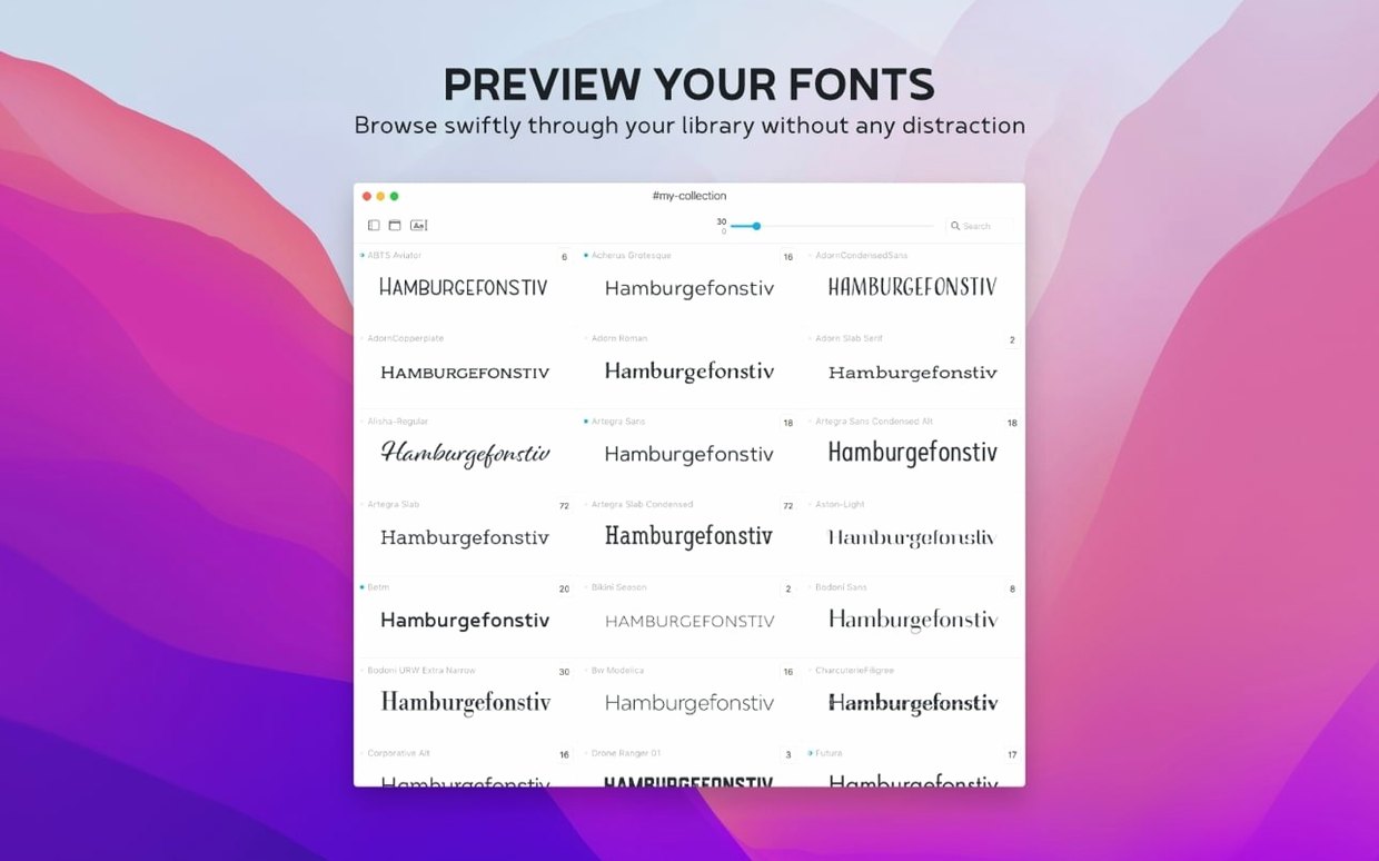
You're scrolling through a folder of freshly downloaded workhorse sans-serifs, trying to remember which one had the cleanest ampersand. Rather than installing them one by one and squinting at a word processor, you open Typeface, point it at the folder, and watch the whole set bloom across the screen in a clean, readable preview. It's a calm, direct way to reconnect with the fonts you already own.
Compare faces side by side without clutter
- Side-by-side comparisons. Typeface shines when you need to size up a few candidates. You can set the preview text, weight, and size, then see the faces next to each other without clutter.
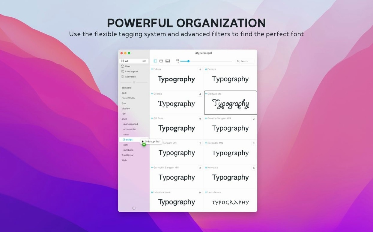
- Keeping things findable with tags. A single font can live in multiple groups—say, "Display" and "Serif"—which makes digging through a large library feel less like archaeology.
- Family grouping and custom collections. The app respects font families and lets you build your own collections, so your favorite faces for editorial work or screen reading stay close at hand.
- Quick notes and sorting. Version 4.5 adds a Notes field and a Last Activated column. Jot down where you used a face, then sort by what you reached for recently.
No install, repair, or cache management tools
- Typeface is a standalone manager for previewing and organizing. It doesn't install, clean, or fix font caches.
- Organization relies on the work you put in. Tags and notes are helpful, but they start empty.
- The app runs on macOS 12 and later, with support for .otc files arriving in the current release.
Pull up three logo alternates by morning
You've just wrapped a logo concept and the client asked for three alternative type treatments by morning. You open Typeface and the window fills with your installed library, grouped by family. The left sidebar shows your custom collections—"Book covers," "Screen UI," "Client proposals"—and you click into the one you built last month while researching geometric sans-serifs.
You type the brand name into the sample text field at the top. Instantly, every face redraws. You bump the preview size to 48 points, then nudge it higher for the display cuts. Three faces catch your eye. You select them, open the comparison view, and there they are: lined up with identical text, identical size, no distractions. One ampersand looks cramped, another sits too heavy. The third settles in just right.
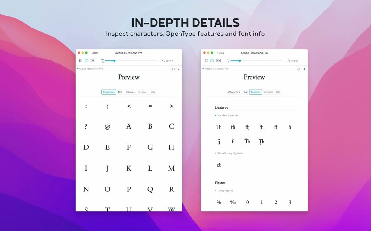
You open its Info tab. The metadata confirms it came from a type foundry you trust, and the Notes field already has a reminder from your last project: "Good x-height for dense paragraphs." You add a new line: "Used in Q3 branding round—client preferred lighter weight." A quick Cmd-T to add a "Branding" tag, and you close the app knowing you can retrace this decision months from now.
Leaves your system fonts and caches untouched
Does Typeface touch my system fonts or font caches? No. It reads what's already installed and displays it. There's no activation mechanism, no cache cleanup, and no background process that fiddles with what macOS already handles. If you remove the app, your fonts remain exactly as they were.
What if most of my fonts aren't installed yet? That's where Typeface feels most practical. You can point it at any folder—a backup drive, a client archive, a stack sitting in Downloads—and it will preview everything without installing a single file. Designers who keep large libraries on external storage lean on this constantly.
Can it handle OpenType collections and variable fonts? The current release added support for .otc files, so OpenType collections display correctly. Variable fonts preview with their full range of weights and styles, as long as they're installed on the system.
Working through a typeface torrent of options
Say you've just pulled down a batch of free display faces from a few independent foundries—maybe thirty files total, a mix of .otf and .ttf, sitting in a folder on your desktop. You want to find two that pair well for a magazine masthead and a supporting sans-serif for body copy.
Open Typeface and drag the folder onto the window. The app reads the files and lays them out in a grid with your chosen sample text—maybe the magazine's name in title case. You set the weight filter to "Bold" first, hunting for a masthead voice. Three options stand out. You tag them "Masthead candidate" and move on.
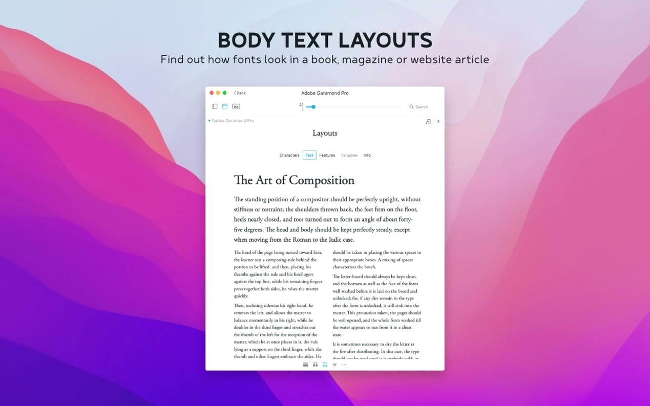
Switch the sample text to a short paragraph. Set the weight back to "Regular" and the size to 11 points. Now you're reading for texture, not impact. You open the comparison panel with four candidates, scroll through the lowercase set in the glyph view to check the a and g shapes, and narrow it to one. You tag it "Body—Q1 issue" and add a note about the line spacing you liked at 14 points. The whole session took under ten minutes, and you never opened a design app or installed a font you didn't need.
Version 4.5 brings a few quietly useful touches to the table.
- New Notes field tucked into the Info tab for each font.
- You can now search across those notes from the overview.
- A Last Activated column and sorting option help you see what you've reached for lately.
- Opens .otc font files without complaint.
- macOS 12 or later
- Runs on Apple Silicon and Intel Macs
Questions I actually get
Can a font belong to more than one group?
Yes. You can assign tags to fonts, so the same face might show up under "Headline" and "Sans-Serif" at the same time.
What file formats does Typeface support?
The current version adds support for .otc font files alongside the standard formats you'd expect a Mac font manager to handle.
Porch talk 0
Come in or pull up a chair to leave a comment.
Nobody has pulled up a chair yet. If you used it on a real Saturday, say what the hour was.
More for the same hour
Everything in Mac Apps
 Tuxera NTFS
2023.1 Mac Apps
111 MB
Tuxera NTFS
2023.1 Mac Apps
111 MB
 TunesKit iPhone Unlocker
2.7.0.16 Mac Apps
64 MB
TunesKit iPhone Unlocker
2.7.0.16 Mac Apps
64 MB
 UltraEdit
25.0.0.11 Mac Apps
28 MB
UltraEdit
25.0.0.11 Mac Apps
28 MB

 Transmit
5.11.7 Mac Apps
Updated 34 MB
Transmit
5.11.7 Mac Apps
Updated 34 MB

 TouchDesigner
2025.31550 Mac Apps
615 MB
TouchDesigner
2025.31550 Mac Apps
615 MB

 Topaz Video AI
1.7.1 Mac Apps
1.6 GB
Topaz Video AI
1.7.1 Mac Apps
1.6 GB
 Topaz Photo AI
2.1 Mac Apps
Updated 36 MB
Topaz Photo AI
2.1 Mac Apps
Updated 36 MB
 Topaz Gigapixel AI
1.3.5 Mac Apps
372 MB
Topaz Gigapixel AI
1.3.5 Mac Apps
372 MB