

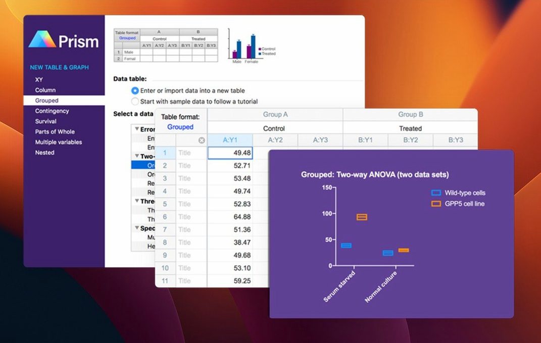
Researchers stepping out of a wet lab and onto a Mac often have Excel open for quick calculations, Photos for microscope shots, and maybe a text editor for notes. GraphPad Prism is the piece that turns those scattered results into clear analysis. It's built for the rhythm of experimental science — organizing repeated experiments, fitting curves, and building the graphs that end up in journals, not just on a screen.
| Detail | Note |
|---|---|
| Version | 11.1.0 |
| macOS | 11 or later, Apple Silicon & Intel |
| Interface | English |
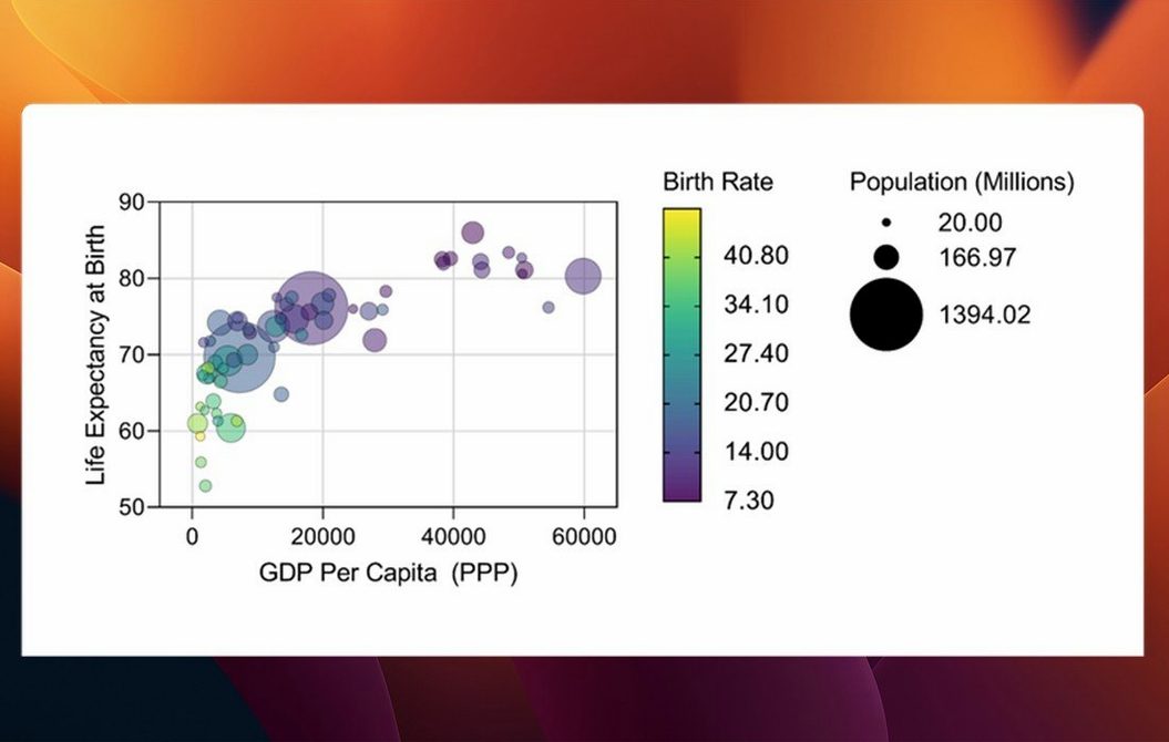
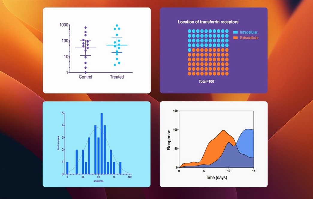
Version 11.1.0 keeps the familiar analysis engine — t tests, multifactor ANOVA, nonlinear regression — while smoothing out the workflow around it. Selecting variables inside analysis dialogs is now a less cluttered process, nudging you toward the right columns without getting in the way. The software also brings new graph styles for multiple variables tables, so a single dataset can be explored as bars, box-and-whisker plots, or violin plots without reshaping everything from scratch. It sits comfortably next to the other tools on your Mac, ready to pick up where a spreadsheet leaves off and handle the statistics that general-purpose apps were never meant to touch.
From raw dose-response data to Monday-ready slides
Picture a Friday afternoon. You have a plate of dose-response data from three separate experiments, and a lab meeting slide deck due Monday. You open Prism, create a new XY table, and paste the numbers straight from your lab notebook. The columns line up immediately — group A, group B, group C — each with its own replicate values.
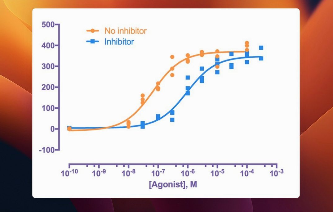
You highlight the table and open the nonlinear regression dialog. Prism suggests a dose-response curve family, and you pick the four-parameter logistic model. One click later, the curve appears over your points, and the results panel shows EC50 values with confidence intervals. You copy the graph into the slide deck, then switch to a multiple variables table to compare the same readout across time points and treatment groups. The new violin plot option shows the spread at each combination in a way bars never could.
Before closing your laptop, you save the project file. Monday morning, you'll open it, tweak axis labels, and export a TIFF at journal resolution — no reanalysis needed.
Built for repeated assays, not general-purpose stats
GraphPad Prism fits best when your work runs on repeated experiments and clear visual communication. It's not a general-purpose statistics package, and it doesn't try to be one.
- Bench scientists who run assays, dose-response curves, and survival studies. The built-in analysis choices match the tests they actually use, without a command line in sight.
- Graduate students and postdocs preparing figures for papers, posters, and committee meetings. The graph defaults look presentable without an hour of fiddling.
- Biostatisticians collaborating with lab teams. Prism handles the core analyses quickly, leaving time for the harder modeling questions in other tools.
- Data analysts in small biotech or pharma groups who need consistent, reproducible outputs across projects. Shared project files keep raw data and analysis in one place.
If you spend your days in R or Python and only need a graph at the end, you'll still find Prism useful as a quick graphing front end. If your work is mostly exploratory and unstructured, a spreadsheet remains the simpler choice.
Set a default graph style so every sheet matches your lab
Out of the box, Prism works. A few small changes make it feel more like your own.
- Set your default graph style. Open Preferences, pick a font and color scheme, and tell Prism to apply it to every new graph. Future exports will already match your lab's conventions.
- Adjust significant digits. In the results preferences, switch from automatic to a fixed number of decimal places. The automatic setting sometimes reports more precision than your measurements justify.
- Turn on automatic recalculation. By default, Prism asks before re-running analyses when data changes. Switching to automatic means your graphs and tests stay current as you edit, which matters when a collaborator updates a cell on a shared Mac.
- Choose your file format for exports. Set TIFF or PDF as the default for graphs, with 300 dpi for print. You'll skip the export dialog's repetitive choices later.
Drag graphs between project files in one move
Some of Prism's best features hide in plain sight, especially if you learned the basics from a quick tutorial and moved on.
- Drag between tables. You can drag a graph from one project file into another, and Prism brings along the underlying data and analysis. This is the fastest way to build a master figure file from several experiments.
- Double-click any graph element. Axis, title, legend, data points — a double-click opens the formatting panel for that exact object. No hunting through menus.
- Use the navigator pane's search field. In large projects with dozens of sheets, typing a keyword filters the list instantly. It beats scrolling through a long tree.
- Copy results as text. From any results panel, choose Copy and paste into a text editor or email. The formatting survives, including column alignment, which makes it easy to share a quick summary without exporting a whole file.
- Reuse analysis settings. After running an analysis, save it as a method. The next time you open a similar dataset, apply the method with one click instead of re-entering every parameter.
- Keyboard shortcuts for navigation. Command-1 through Command-5 switch between the main view modes — data tables, info, results, graphs, and layouts. It becomes muscle memory after a few sessions.
If you're coming to Prism fresh, give yourself an afternoon to explore. The learning curve is gentle, and the habits you build in that first session — keyboard navigation, saved methods, smart defaults — will quietly save you hours over the next year of experiments.
This update brings a few welcome tweaks for anyone working with multi-variable data.
- New graph types for multiple variables tables, including violin and box-and-whisker plots.
- Categorical level ordering now available for those multiple variables tables.
- Streamlined variable selection inside analysis dialogs for common tests.
- macOS 11 or later
- Apple Silicon or Intel processor
- Interface language: English
Questions I actually get
What kind of analysis can GraphPad Prism perform?
It handles t tests, multifactor ANOVA, nonlinear regression, simple survival analysis, and curve fitting, all designed specifically for experimental science workflows.
Can I make different types of graphs from the same data?
Yes. Version 11.1.0 added graph types like bars, box-and-whisker plots, and violin plots for multiple variables tables without needing to reorganize your data.
Does GraphPad Prism work on both Apple Silicon and Intel Macs?
It runs natively on both Apple Silicon and Intel Macs, requiring macOS 11 or later.
Porch talk 0
Come in or pull up a chair to leave a comment.
Nobody has pulled up a chair yet. If you used it on a real Saturday, say what the hour was.