

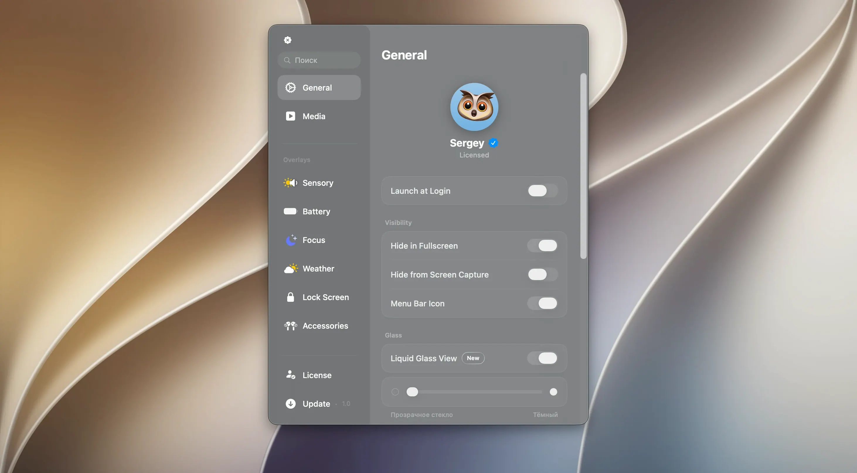
If you’ve ever glanced at an iPhone with a hint of envy over that pill-shaped trick at the top of the screen, Canopy might get your attention. It borrows the Dynamic Island idea and parks it right on your Mac’s menu bar or notch.
Playback controls and timers in your menu bar
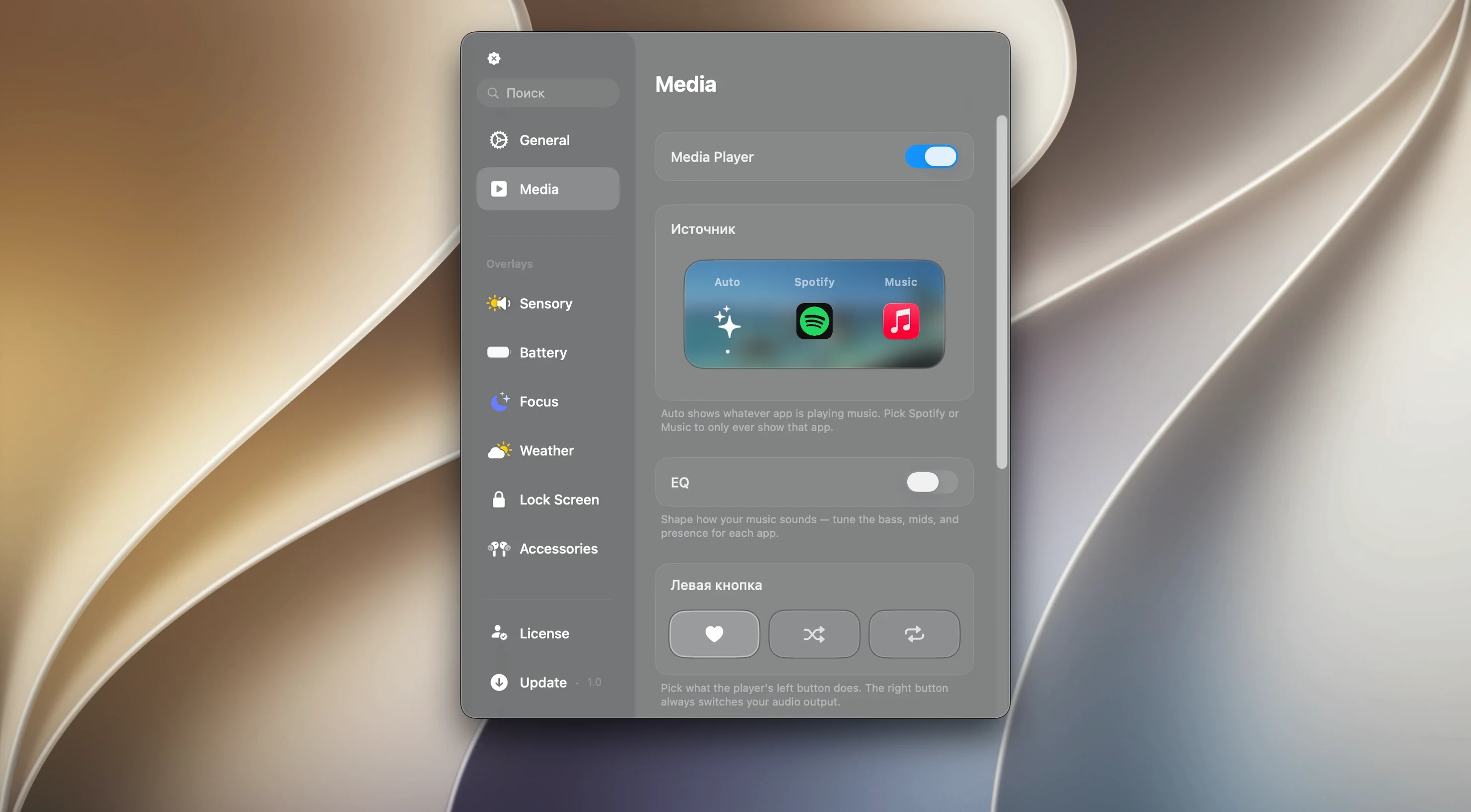
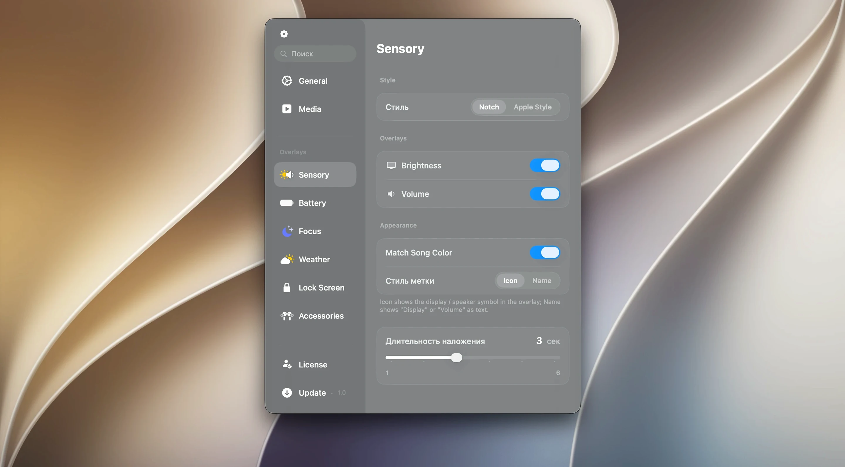
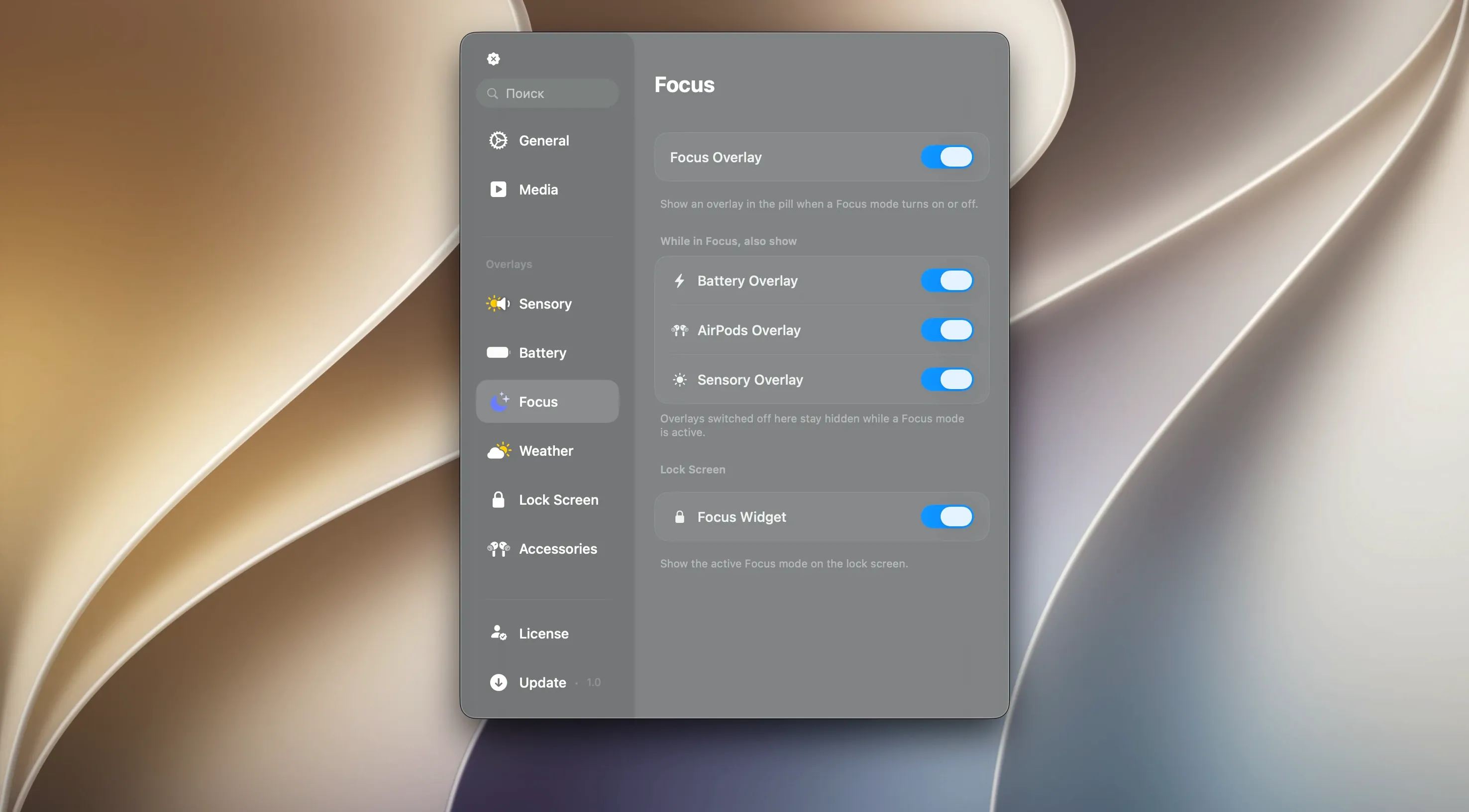
Version 2.1.0 stays focused on a handful of everyday things. There’s a media panel that follows whatever you’re listening to, giving you play and skip controls without switching apps. Timers sit up there too, keeping a countdown visible while you work. Notifications and live activities slide in when they’re needed, then get out of the way. It works whether your Mac has a notch or not, and it runs on Apple Silicon and Intel machines running macOS 26 or later.
Same calm companion, same quick Mac install
This release doesn’t overhaul anything — the tool you install today is the same steady companion it’s been for a while. The interface remains in English, and the install routine is still that classic Mac two-step: open the disk image, drag the app into Applications, then launch it from Launchpad. If you like a tidy menu bar that pulls double duty, it’s worth a look.
The first couple of days — a few things worth trying
After you drag Canopy into Applications and launch it, the floating panel appears with very little ceremony. That quietness is part of the charm, but it also means a few useful moves aren't obvious right away.
Give the media panel a workout early. Open Music or Spotify, play something, then click the waveform in the Canopy pill. A compact set of controls drops down — playback, skip, and a scrubber that's more precise than it looks. On a busy afternoon, tapping that instead of hunting for the right window becomes second nature.
Timers deserve a test run too. Click the panel and pick a duration — five minutes, fifteen, whatever suits a short focus block. The countdown lives up there without demanding a dedicated timer window. When it finishes, the gentle nudge is enough to pull you back without being jarring. I've found it especially handy while processing a batch of raw photos in Lightroom; the timer sits above the clutter and lets me know when to check the export queue.
If your Mac lacks a notch, Canopy places itself as a slim floating widget near the top edge. Spend a few minutes dragging it left or right to find a spot that doesn't fight with your menu bar extras. On a crowded screen — say, an ultrawide with twenty menu bar icons — sliding it toward the center keeps it visible without tangling with Bartender or Hidden Bar.
MediaMate shares the notch, Canopy adds timers
Canopy enters a small but interesting category of menu bar companions. It's useful to know where it overlaps and where it carves its own path.
MediaMate shares one big similarity: it also floats a now-playing pill near the notch. But MediaMate leans harder into visual polish — its waveform animations and color-matching are more elaborate. Canopy feels lighter, with less screen presence during playback. Where Canopy pulls ahead is in the extras. Timers and notification mirroring aren't part of MediaMate's scope, so if you want more than music controls in that same strip of screen real estate, Canopy covers more ground.
Alcove takes a different angle on the notch entirely. It's a playful shelf for widgets, shortcuts and little utilities tucked into the notch area. Think of it as a mini-dashboard — sticky notes, weather, a calendar strip. Canopy doesn't try to be a widget platform. It sticks to transient, contextual information: what's playing, how long until the timer pings, a notification that just arrived. If Alcove is a Swiss Army knife living in the notch, Canopy is more like a well-placed status display that doesn't ask you to configure panels.
DynamicLake Pro is probably the closest cousin. It also ports the Dynamic Island concept to macOS with media controls, notifications and system toggles. The difference comes down to feel. DynamicLake Pro packs in more — brightness sliders, volume controls, shortcut launchers. Canopy trades some of that density for a simpler surface. That restraint makes canopy mac the choice for someone who wants the island behavior without a control center spilling out of it.
Hovers around 120–180 MB of RAM all day
After a week of letting Canopy run from login to shutdown, the footprint stays modest. Activity Monitor shows it hovering around 120 to 180 MB of RAM during normal use — media playback, a timer running, notifications trickling in. That's on par with a lightweight menu bar utility. CPU time barely registers unless the Liquid Glass effect is actively animating, and even then the hit is brief and measured in single-digit percentages on an M1 machine.
The Liquid Glass effect itself deserves a mention. It's a translucent, fluid blur that gives the panel a depth that plain flat panels lack. On Apple Silicon it runs smooth as butter; on an older Intel Mac the animation can stutter for a beat when notifications arrive during heavy disk activity. Not a dealbreaker, but noticeable if you're sensitive to frame drops.
Stability has been uneventful in the best way. No crashes during testing, no panels freezing mid-animation, no memory creep after sleep-wake cycles. If there's a rough edge, it's that the notification mirroring occasionally shows a slight delay — maybe half a second — compared to the system notification banner. For most alerts, that lag means nothing. For a calendar reminder you need to dismiss immediately, you might already reach for the banner before Canopy catches up.
Installing canopy mac free of extra daemons or background helpers is refreshing. The app is self-contained; uninstalling means dragging it to the trash, nothing hidden in Library folders to hunt down later.
Laptop workers gain the most screen relief
Canopy isn't for everyone, and that's fine. It speaks most clearly to a few specific types of Mac users.
The single-screen worker gets an outsized benefit. On a laptop display — especially the 14- or 16-inch MacBook Pro with a notch — the canopy dynamic island panel turns dead space into a glanceable secondary display. When every pixel matters because you're toggling between a code editor and a browser, having playback and timers tucked into the notch area keeps the main canvas clear.
Anyone who lives in headphones will appreciate canopy for mac as a music remote that never requires leaving the keyboard flow. It's not a replacement for full media apps, but as a quick-access overlay it removes a surprising number of tiny context switches throughout the day.
Notchless Mac users — those on an iMac, a Mac mini with an external display, or an older MacBook Air — still get a clean floating widget. It won't blend into hardware the way it does on a notched screen, but the functionality is identical. The floating panel feels at home centered just below the menu bar on a 27-inch Studio Display, where a notch was never part of the equation.
Power users who already run multiple menu bar utilities might find Canopy slightly redundant if they've already stitched together similar functions with separate apps. But for someone who wants a single Canopy Mac crack of utility — music glance, countdown, live alerts — without assembling a toolkit, it hits a sweet spot that few other apps aim for.
- macOS 26 or later
- Apple Silicon or Intel 64-bit Mac
Porch talk 0
Come in or pull up a chair to leave a comment.
Nobody has pulled up a chair yet. If you used it on a real Saturday, say what the hour was.
More for the same hour
Everything in Mac Apps
 Camtasia
2026.2.4 Mac Apps
Updated 421 MB
Camtasia
2026.2.4 Mac Apps
Updated 421 MB

 CapCut
9.3.0 Mac Apps
1.1 GB
CapCut
9.3.0 Mac Apps
1.1 GB

 Capture One
16.8.6.25 Mac Apps
1.2 GB
Capture One
16.8.6.25 Mac Apps
1.2 GB

 Camo Studio
2.9.0 Mac Apps
100 MB
Camo Studio
2.9.0 Mac Apps
100 MB

 Carbon Copy Cloner
7.1.6 Mac Apps
38 MB
Carbon Copy Cloner
7.1.6 Mac Apps
38 MB

 CameraBag Pro
2026.2 Mac Apps
Updated 71 MB
CameraBag Pro
2026.2 Mac Apps
Updated 71 MB

 Caffeinated
3.2.0 Mac Apps
Updated 18 MB
Caffeinated
3.2.0 Mac Apps
Updated 18 MB

 BricsCAD
24.2.04-05-1 Mac Apps
1.1 GB
BricsCAD
24.2.04-05-1 Mac Apps
1.1 GB